The challenge
Infrarrojo estudiois a company that seeks to transform its quality and experience from a team of specialists, to offer customers a complete and efficient service compared to the current market.
The design market is very competitive because some people who have not studied this profession are developing it incorrectly and there´s some platforms that perform such services but without the efficiency and experience of an agency.
Concept and construction
branding
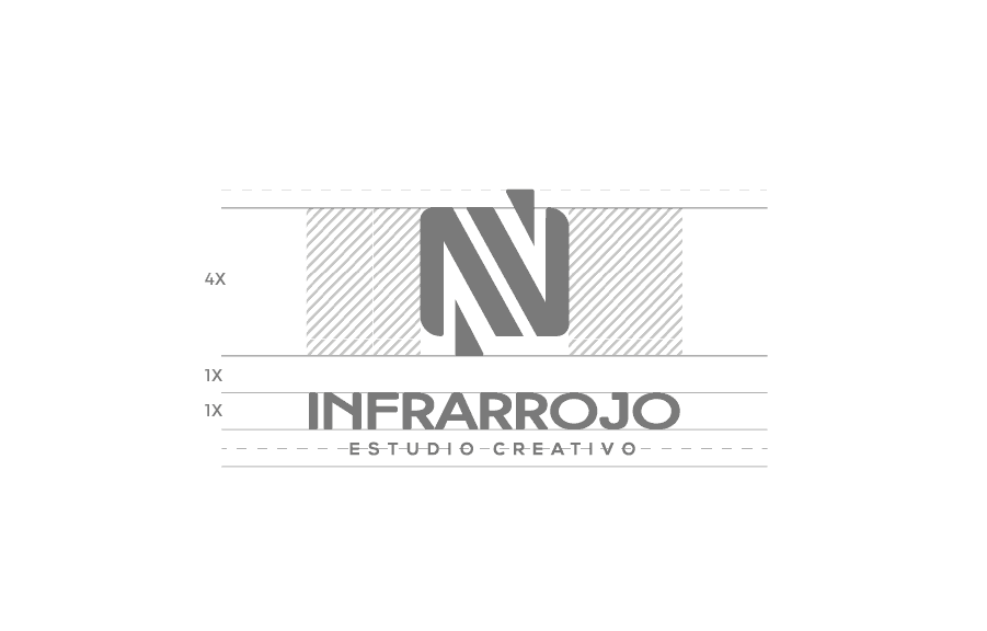
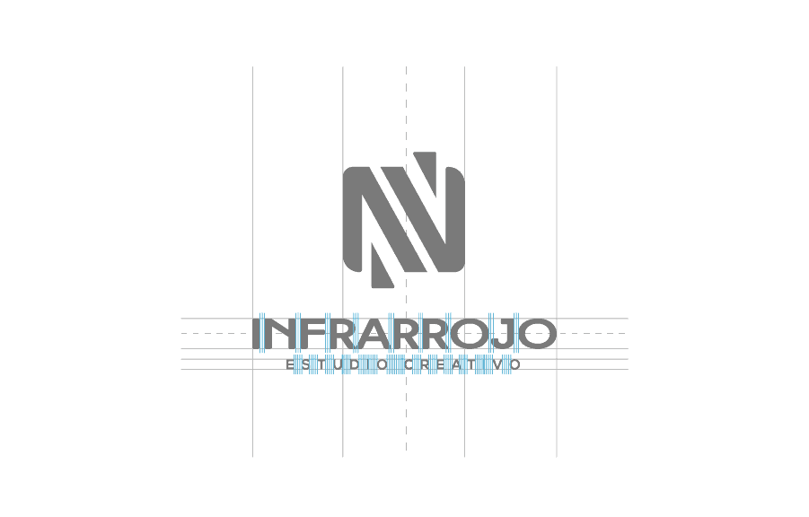
While we created the brand, its name was born on the spectrum of light below the human vision called infrared, which we can identify the heat in objects, even an ice cube has heat, so we show it in the brand, to prove that even the coldest brand can become friendly, creative and successful.
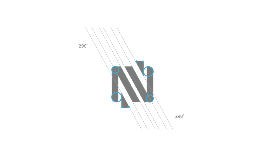
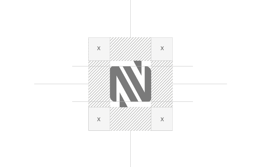
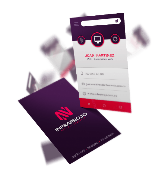
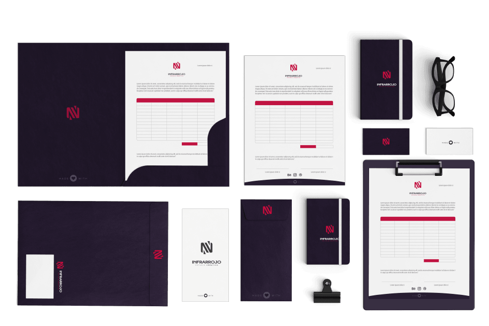
When implementing the chromatic palette we thought of purple as the color of magic and imagination and with pink, which means love and passion for each project in the studio, the structure of the isotope is the incarnation of a structure that is coming together, reflecting the teamwork to achieve incredible projects.








Web page
Responsive and easy to navigate
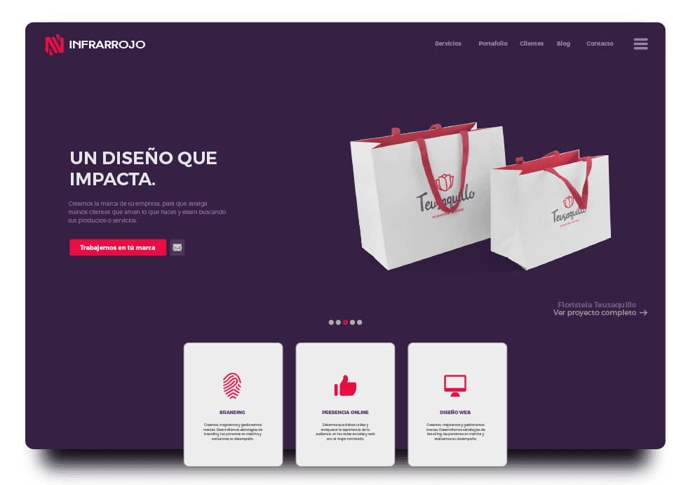
The web design was made taking into account the photography and mockups of the different projects to be the main point of attention, clean organization giving importance to small blocks of text and large images with sober color contrasts but that contribute to each photograph to capture the visitor.
